
Xianna
Brand Identity · Rebranding
Overview
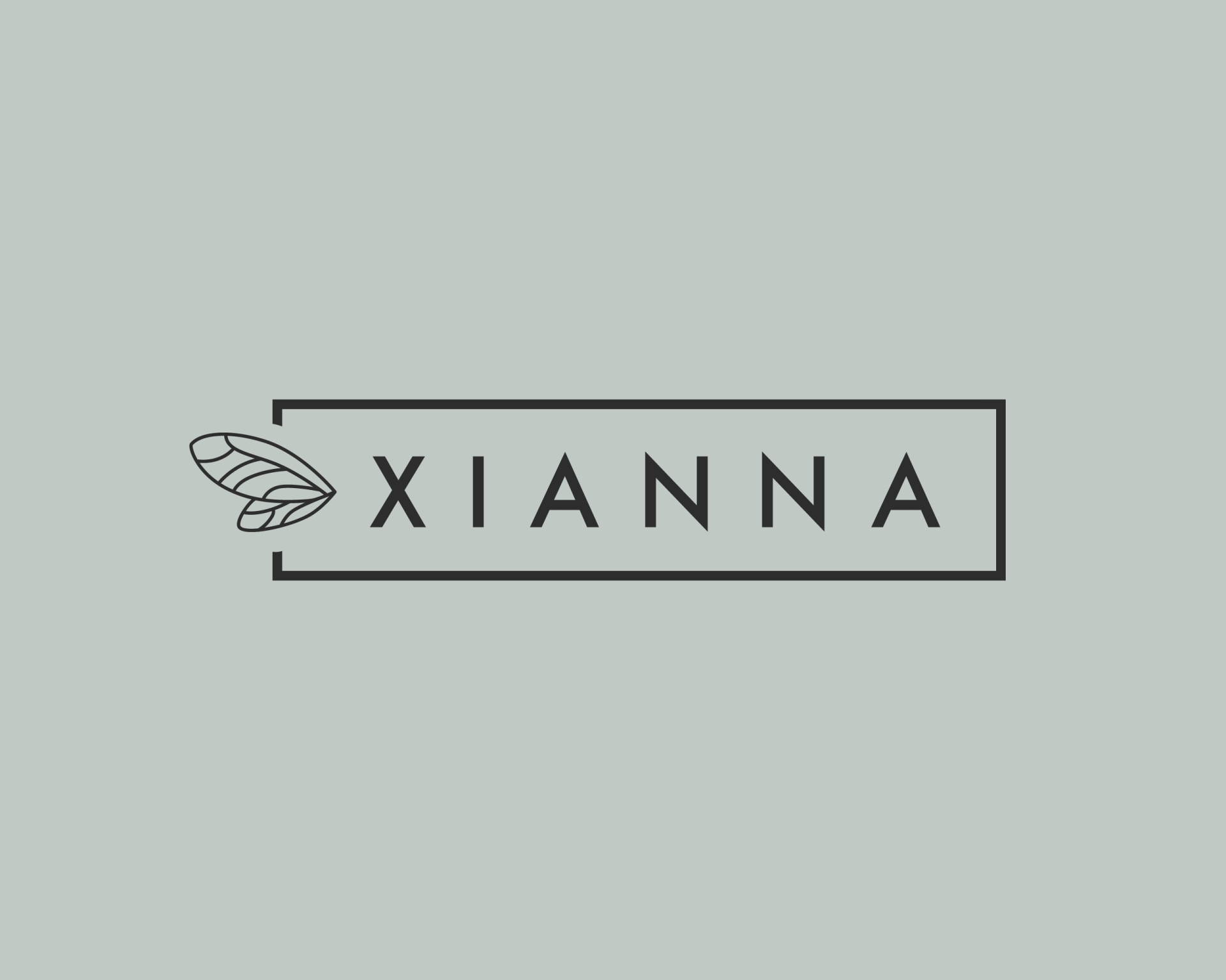
Xianna designs and produces handbags made primarily from cork — a natural material that is durable, waterproof, sustainably harvested, and kind to the environment. The brand needed a rebrand that could hold all of that: design-led, minimal, and rooted in nature.
The Approach
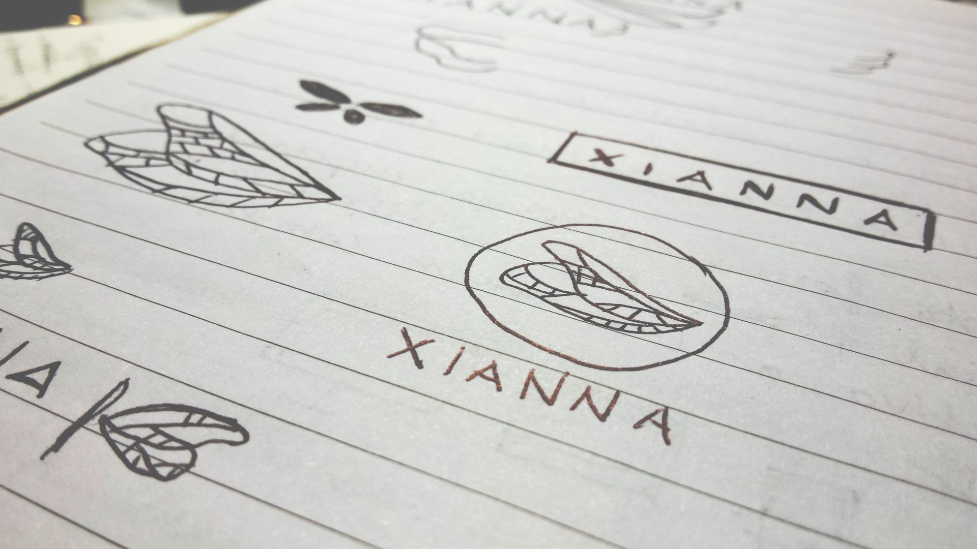
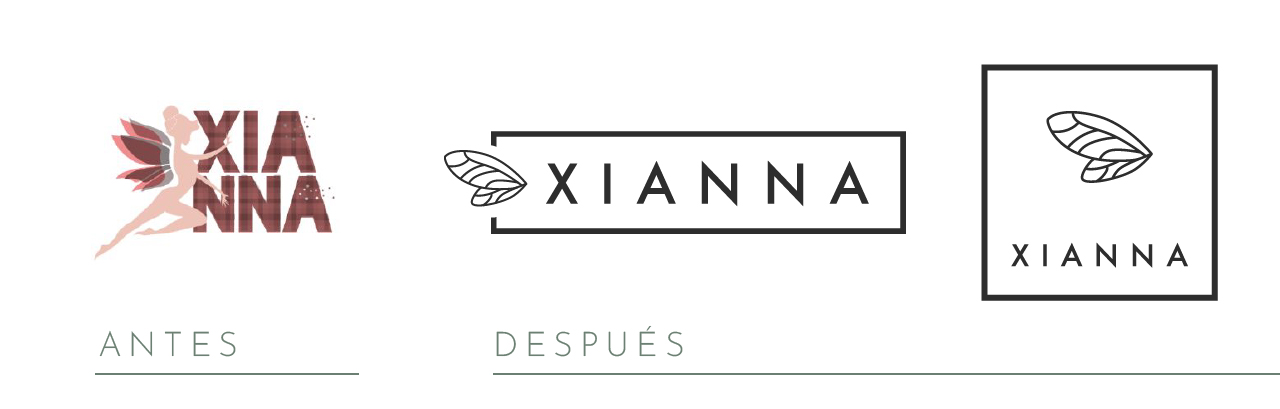
The original brand featured a fairy as its central symbol. Rather than replacing it, I stripped it back — keeping only the wings. A single gesture that preserves the brand’s character while aligning with the minimalist aesthetic of the bags themselves.
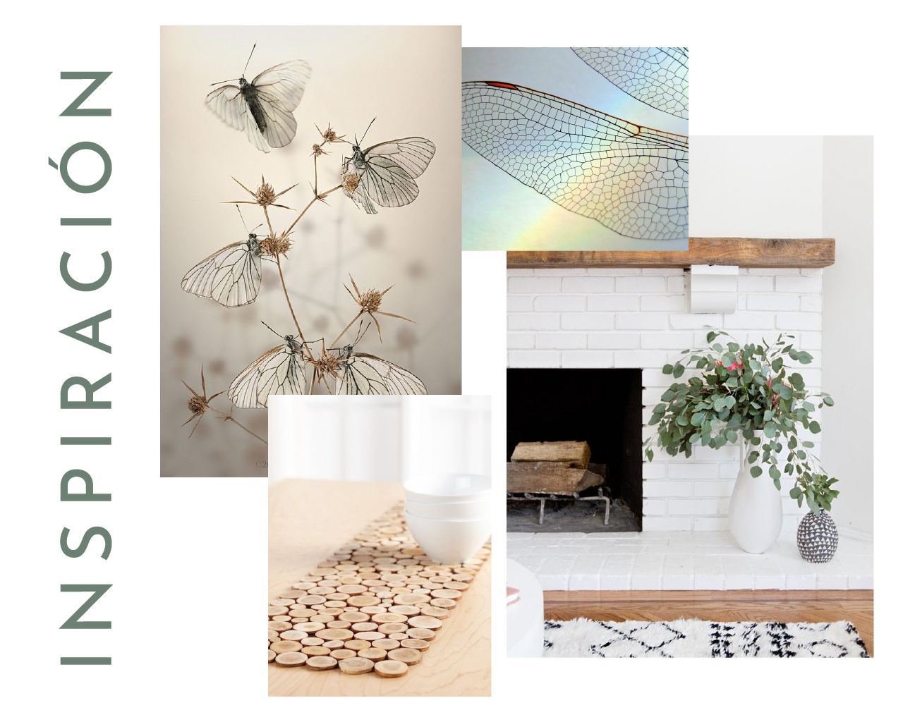
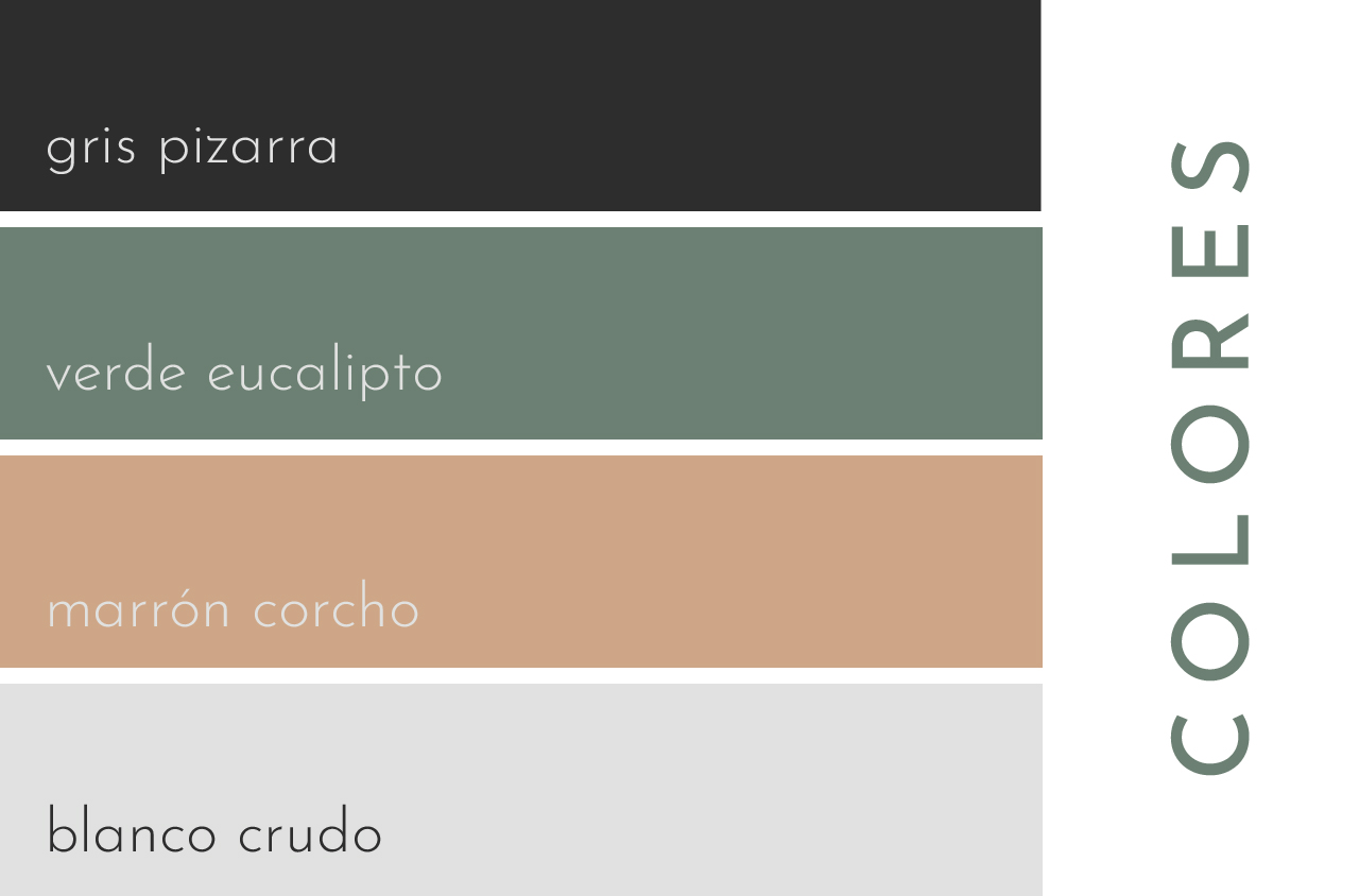
The colour palette draws directly from the materials: cork and eucalyptus. Nothing decorative, nothing arbitrary.
Task
Brand rebranding